All video games are captive to the constraints of technology. But sometimes human ingenuity and art can creatively circumvent reality’s would-be limitations, resulting in something unexpected — except to those who worked tirelessly to make it possible.
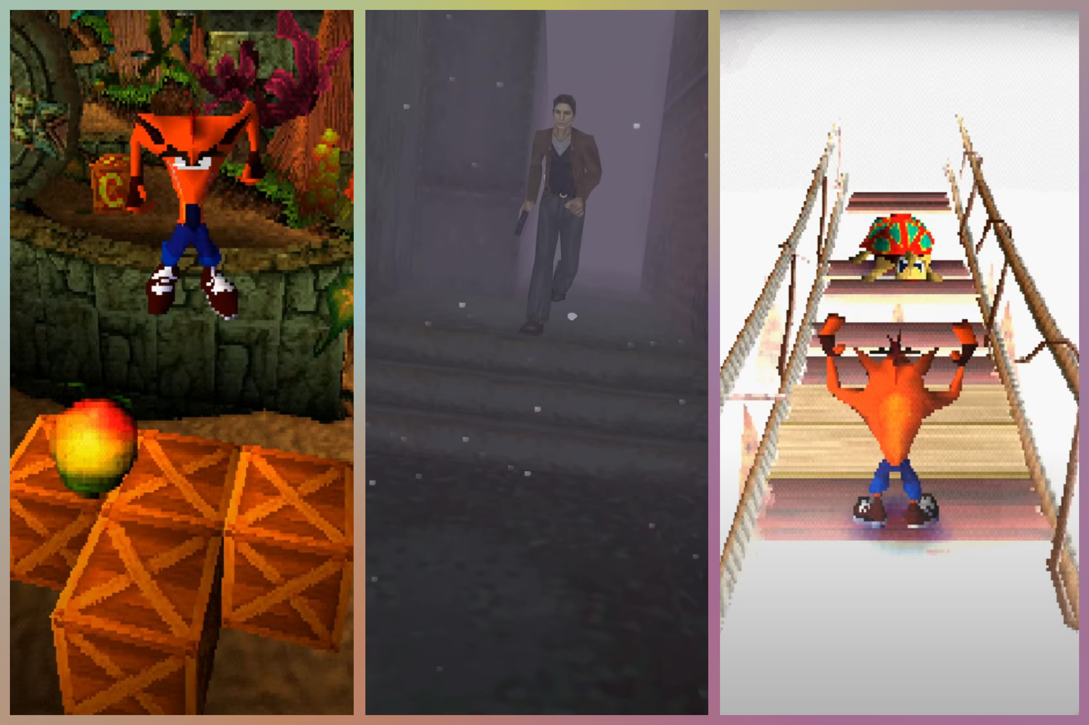
It’s difficult to imagine Silent Hill without its spooky, ominous fog, or Crash Bandicoot without crates to smash, but sometimes developers stumble into iconic aspects of games while simply looking for creative solutions to technical problems keeping them awake at night. In the 1990s, when those two games were in development, both teams had to contend with the limitations of the very first PlayStation console — no small feat, but audiences were ready to explore and play in 3D spaces.
Andy Gavin, Naughty Dog co-founder and co-creator of Crash Bandicoot, articulated how technical constraints in game design can function like a framework, while discussing the development of the first Crash Bandicoot with Ars Technica in 2020.
“One of the great things about designing for consoles … [was] the consoles had this fixed hardware. It was designed for video games, and you knew what you were getting. Yes, you had very small amounts of memory. Yes, you had this specific GPU and this specific CPU, but that was actually a kind of freedom. It’s like writing a sonnet and knowing that you’re gonna stick to Shakespeare’s sonnet rules.”
Crash Bandicoot and Silent Hill don’t have to be your favorite games, or even games you’ve played, for you to appreciate what their creators were able to achieve visually and technologically. It was all effectively done by reverse-engineering from the Sony PlayStation’s hardware limitations at a time where everyone was figuring out what it meant to play games in three-dimensional spaces.
Cutting rooftops instead of corners

It’s a lot easier to know the details of how everything came together with Crash Bandicoot since Andy Gavin, Jason Rubin, and so many of the other people who worked on it have all been so vocal about their contributions. It isn’t always possible to verify information on a game’s development when creators aren’t forthcoming about the process, and this is especially true for Silent Hill. Some of the information we have learned about the Silent Hill franchise comes from the few interviews with some members of Team Silent over the years, but much has also been learned about the game from dedicated fans accessing Silent Hill’s files and digging through unused assets. Fans’ efforts have confirmed that many of the game’s assets — including the rooftops of houses and businesses — are completely unfinished and missing entirely, but they’re hidden under the town’s trademark fog.
Compromises are an inevitable part of wrestling with technology for a means to an end, and this was especially true during the first PlayStation generation, when 3D development brought new problems and creative solutions.
Sometimes the solutions to these problems were elegant and creative, leading to programmers accidentally stumbling into integral parts of a game’s identity: Crash Bandicoot smashing through crates; or Silent Hill developers covering the world in a scary fog, reusing the locations from Kindergarten Cop as a template for what a typical American small town could look like, and using virtually unchanged logos for iconic American brands like Pepsi and 7-Eleven. Because what might look like missing rooftops and recycled malls from Hollywood movies could actually be a small, Lynchian American town lost in itself, like a collapsing fever dream melting around the player trying to find a way out.

Silent Hill had an elegant and simple system for managing the game’s visible, on-screen polygons, with developer Team Silent embracing the limited draw distance of the Sony PlayStation console by burying it all in a mysterious fog. This allowed the developer to buy style and atmosphere with what they couldn’t — or simply didn’t need to — actually build.
In a 1999 interview with Official U.S. PlayStation Magazine, Keiichiro Toyama, Silent Hill’s producer and director, talked about the team’s goal with atmosphere, storytelling, and the use of the technology of the time. “There were two main concepts we wanted to put into this game. One is that we wanted to make the player feel that the world exists. We took influences from Stephen King for the modern horror atmosphere, so you have all these indications that this is taking place in our modern world. We wanted to have the horror feeling, but we also wanted to make it feel real to the player. The second concept we wanted to focus on was the technology, to create this world in full polygons with a free-floating camera that changes a lot to keep the player really unbalanced, and to use a lot of fog effects and lighting effects.”
Unboxing the Bandicoot
Crash Bandicoot had its own twist on polygon occlusion, with developer Naughty Dog effectively gamifying the polygonal occlusion of Doom’s “monster closets,” which ended up being a game-changer for Crash Bandicoot and 3D gaming as a whole.
Managing the amount of visible polygons on screen became a top priority early in the development of Crash Bandicoot because it was clear to Naughty Dog that it was the best way to squeeze the most out of the PlayStation’s hardware.
Crates are one of the first things that come to mind for most people when they think of Crash Bandicoot, but this particular piece of the game’s formula didn’t come to Rubin and Gavin until after it was in a “finished” alpha state with fully playable levels.
Gavin and Rubin had a game that was playable, a game that worked, and a game that looked great — but, in Gavin’s words, “these cool levels were missing something.”
“We’d spent so many polygons on our detailed backgrounds and ‘realistic’ cartoon characters that the enemies weren’t that dense, so everything felt a bit empty. We’d created the wumpa fruit pickup (carefully rendered in 3D into a series of textures — burning a big chunk of our VRAM — but allowing us to have lots of them on screen), and they were okay, but not super exciting.
“We knew we needed something else, and we knew it had to be low polygon, and ideally, multiple types of them could be combined to interesting effect. We’d been thinking about the objects in various puzzle games.
“So crates. How much lower poly could you get? Crates could hold stuff. They could explode, they could bounce or drop, they could stack, they could be used as switches to trigger other things. Perfect. So that Saturday we scrapped whatever else we had planned to do and I coded the crates while Jason modeled a few, an explosion, and drew some quick textures.
“About six hours later we had the basic palate of [Crash Bandicoot’s]’s crates going. Normal [crate], [extra] life crate, random [question mark] crate, continue crate, bouncy crate, TNT crate, invisible crate, switch crate [for puzzles]. [We even had] the stacking logic that let them fall down on each other, or even bounce on each other. They were awesome. And smashing them was so much fun,” Gavin explains in a February 2011 post on his blog about Crash Bandicoot’s development.
That’s when Naughty Dog knew it had a video game. It worked. It was beautiful. And it was fun to play.
“Over the next few days [Jason and I] threw crates into the levels with abandon, and formally dull spots with nothing to do became great fun. Plus, in typical game fashion tempting crates could be combined with in game menaces for added gameplay advantage. We even used them as the basis for our bonus levels,” Gavin explains in the February 2011 blog post.
Old cartoons and polygons
Crash Bandicoot’s physical appearance might be the second-most iconic part of the game, after the crates — and yet it also was a product of technical limitations.
Inspired by Looney Tunes and other classic animation, Gavin and Rubin enlisted Joe Pearson and Charles Zembillas, two Hollywood animators, to help design the concepts for characters and level locations. But once that was done, Jason Rubin and art director Bob Rafei had to make the designs work on the actual PlayStation console hardware.
“We were wrestling with these design constraints the entire process. Joe and Charles … were free to do anything that they could imagine on paper. But Bob and I were the artists that eventually had to ground that back in the reality of [a] calculator strapped to a TV that was the PlayStation 1,” wrote Jason Rubin in the February 2011 blog post.
Every polygon for Crash Bandicoot was heavily scrutinized and held up to a microscope, for more than one reason: Crash had to look right and play right, through every second of gameplay. And that’s why Crash Bandicoot ended up being orange.
“Why is Crash Orange? Not because we liked it, but because it made the most sense,” wrote Rubin. “First I created a list of popular characters and their colors. Next I made a list of earthly background possibilities (forest, desert, beach, etc.) and then we strictly outlawed colors that didn’t look good on the screen. Red, for example, tends to bleed horribly on old televisions. At the time, everyone had old televisions, even if they were new!
“Crash was orange because that was available. There are no lava levels, a staple in character action games, because Crash is orange. We made one in Demo [the working build the team plays during early testing], and that ended the lava debate. It was not terribly dissimilar to trying to watch a black dog run in the yard on a moonless night.”
Similarly, Crash’s head is giant because of how limited TV resolution was in the ’90s, and because it was important to Naughty Dog that the player be able make out Crash’s facial expressions during gameplay.
“Why does Crash have gloves, spots on his back, and a light colored chest? Resolution, bad lighting models, and low polygon counts. Those small additions let you quickly determine what part and rotation of Crash you were looking at based on color. If you saw spots, it was his back. Yellowish orange was the front. As the hands and arms crossed the body during a run the orange tended to blend into muck. But your eyes tracked the black gloves as they crossed Crash’s body and your mind filled in the rest,” wrote Rubin in the blog post.
Early Crash Bandicoot character sketches had him wearing a striped hat, and another featured Crash Bandicoot with a tail, but both options were immediately shot down by Rubin because they wouldn’t consistently work well in the game.
“I can tell you immediately that the tail and any kind of flappy strap was immediately shot down because it would have flickered on and off as the PlayStation failed to have pixels to show it,” Rubin wrote. “[We gave Crash] shorter pants [to avoid what] would have been an annoying orange flicker every few frames around the bottom of his pants and shoes.”
Through an assortment of programming tricks, co-developer Dave Baggett and Gavin were able to squeeze the PlayStation for 800 visible polygons on screen at once — but the PlayStation hardware wasn’t able to do the calculations, which meant that Naughty Dog had to do it in advance.
“The idea was that the camera would follow along next to, behind, or in front of [Crash Bandicoot], generally looking at him, moving on a ‘track’ through the world … [and] from any given position we could have perfect occlusion and sort, with no runtime cost. We conceived of using trees, cliffs, walls, and twists and turns in the environment to hide a lot of the landscape from view — but it would be there, just around the corner,” wrote Gavin in another 2011 blog post.
“We also wanted vast and detailed worlds … Dave and I were convinced that extensive pre-calculation of visibility could allow the renderer to handle A LOT more polygons. So we did experiments in free roaming camera control and settled on branching rail camera [plus] pre-calculation [polygon visibility],” which would allow for “gorgeous visuals,” Gavin continued.
In the end, everything about Crash Bandicoot’s character design and gameplay was a response to what worked within the technical constraints at the time, with creative solutions also helping to shape the game itself. This was true for Silent Hill as well, with Team Silent’s method of polygonal occlusion working equally well as window set dressing.
Compromises are an inevitable part of wrestling with technology for a means to an end. These sorts of compromises have happened across many hardware generations: Mass Effect has three-minute elevator rides in a world with interstellar space travel. But Silent Hill’s and Crash Bandicoot’s developers have shown that these limitations can end up accidentally creating some of the most iconic moments in their respective games.
Source:https://www.polygon.com/playstation/24196061/silent-hill-crash-bandicoot-tech-limitations


